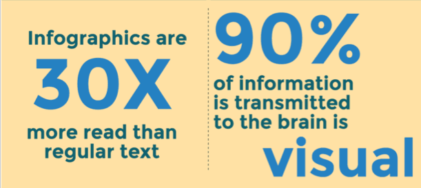
Infographic about infographics
Digital marketers (and marketers in general) are very cleaver. They understand our behaviours, and make the best out of it. They do this in a very tricky way. It’s always interesting to look at that in terms of strategy and creativity. You might ask what this has to do with infographics? I’ll tell you. It has been shown that 65% of us are visual learners , and that an information has 3 times more chance of being read and understood when it is presented in a visual way. I personally enjoy and understand information more easily when it is communicated with graphics, colours and attractive font. Every morning, I go through my Twitter feed- a little bit of personal community management never hurt nobody- and I see so many infographics being shared. This is mainly why I chose to write this article. Let’s discover and understand this new graphical and colourful trend together ! Ready?
Visualising Information, the power of infographics
People today do not have the time to read long posts or long articles. And of course, do not expect them to remember what they read. It is not a bad thing, it is just a fact. Today, we all read articles we find on social media, while commuting to work, to home, or to a friend’s house. That’s the pace we live in today. The more digitalised we are, the more our focus is weak. It is easy to get distracted when reading an amazingly interesting article on mobile. It is simply because we are always in a rush, multitasking different tasks and screens.
Infographics embrace this problem, and give its audience the solution: defy time by highlighting important information. How? By simply making it more attractive to readers. When someone sees a large number on a page, they are more curious to know what this 85% means, what phenomenon it is linked to and so on.

When we see information, we can visualise the link between different elements on a particular theme or subject. This way, complex information is broken down into different eye-catching graphics.
Visualising information has a very strong persuasive aspect. That is what makes infographics so powerful. Compare the following two actions, and you tell us which one is easier, in your opinion. The first one is reading a long text, and trying to find that one golden number that we are looking for. The second is looking at a poster, an infographic, and scan through the highlighted information in a few seconds.
Basically, marketers use the power of (info)graphics to communicate complex concepts, to explain them, and make it simple for people to grasp the main information that the infographic is highlighting.
What makes a good infographic?
Now that we understand why infographics are amazing, let’s go through the main elements that make a good infographic.
To begin with, it is a good idea to give your reader a context. This will help them get in a certain state of mind, and dive into the subject you are presenting.
Also, I think it is very obvious yet important to say that good graphics are crucial too. The point of using an infographic is to be clear, to represent thoughts in a clear way, and not scribble around and expect people to understand ! Right ?
And about graphics, you should stick to one visual theme. My main advice: Do not mix graphic styles, as illustrated below:

When you create an infographic, you want to reach people. The more people read your information, the happier you are. So, to make you happy, encourage people to share your infographic. Now you might ask, how to make an infographic ‘sharable’? Three rules: keep it simple, share it on your own social media with a call to action, and upload it on your Slideshare (that you will embed in blog posts, and share on your social media pages etc.)
Now you know the secret. I’ll share my infographic with me. Check it out below !
&nbs


